
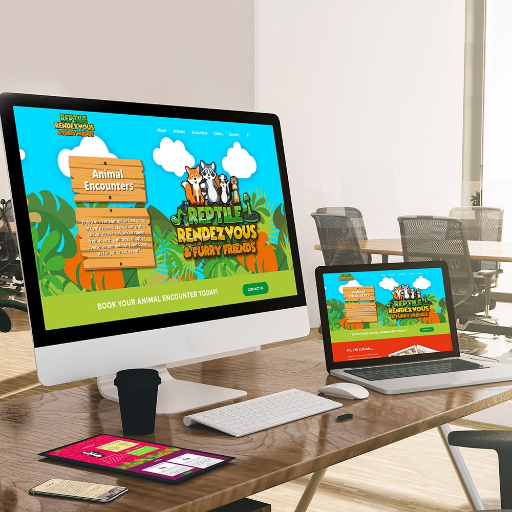
In case you didn’t know, responsive web design and responsive websites have actually been around for a number of years now. In a nutshell, a responsive website adjusts itself to fit any device it is being viewed on. For example, a website that you have viewed on your desktop PC or laptop, would look very different on a mobile phone or tablet. The idea is to allow the viewer to get the best experience when viewing a website and often a simplified version for viewing on smaller screened devices, just makes the whole process easier. Also, websites viewed on smaller devices require touchscreen navigation, as people tend not to carry a mouse or trackpad around in their pockets!
Browsing behaviour over the past 4 years
2013 saw a huge rise in the number of users who view the internet from a mobile device. Then in 2014, this figure exceeded the number of users who browsed from a fixed internet access point. 3 years on, this figure has grown even bigger, with over 80% of people who use the internet owning a smartphone.
How Responsive Web design works
Responsive websites are built using a series of fluid grids. Previously, websites were designed and comprised of a fixed width and fixed elements inside. We, as web designers, only had to think about how the site would be viewed on a 13 or 15 inch monitor or laptop. Now, with desktop screens getting bigger and mobile devices smaller, we needed a solution to allow for a better viewing experience, regardless of device. This is where proportion came into play, along with the evolution of fixed to fluid.
Most layouts are built using columns with widths decided by percentages. For example, a common layout is 2 columns at 50% width each. These columns will reduce and enlarge in proportion to the device they are viewed on. Then, if the screen is too small, the columns would adjust and sit on top of each other, this is the responsive bit. Images within these columns would also adjust respectively, so as not to overlap each other or hang off the edge of the page. Coding these days can also tell websites to adjust the size of their text, dependant on device size. Also, a technique I like to use is hiding certain elements on smaller screens, so as not to clog up a webpage being viewed on a smartphone. It’s crucial we keep the end user in mind throughout the entire design and build process.
Why your website needs to be responsive, now!
If you still have a website that is fixed in width and none responsive, it’s very likely you will have suffered a dramatic loss in traffic and ultimately revenue. This is because in 2015, Google began to penalise websites that don’t offer a responsive experience for viewers. Google and its algorithms decided that responsive web design was an essential element to user experience.
So, if you’re on the ball and already have a sweet looking responsive website, well done! If you don’t, it’s already cost you more than you will ever know, so get it fixed!
Of course, all of the websites we develop here at Lucid Theory are responsive as standard. If you’re thinking about getting a new website, or an update to your existing one, contact us!


